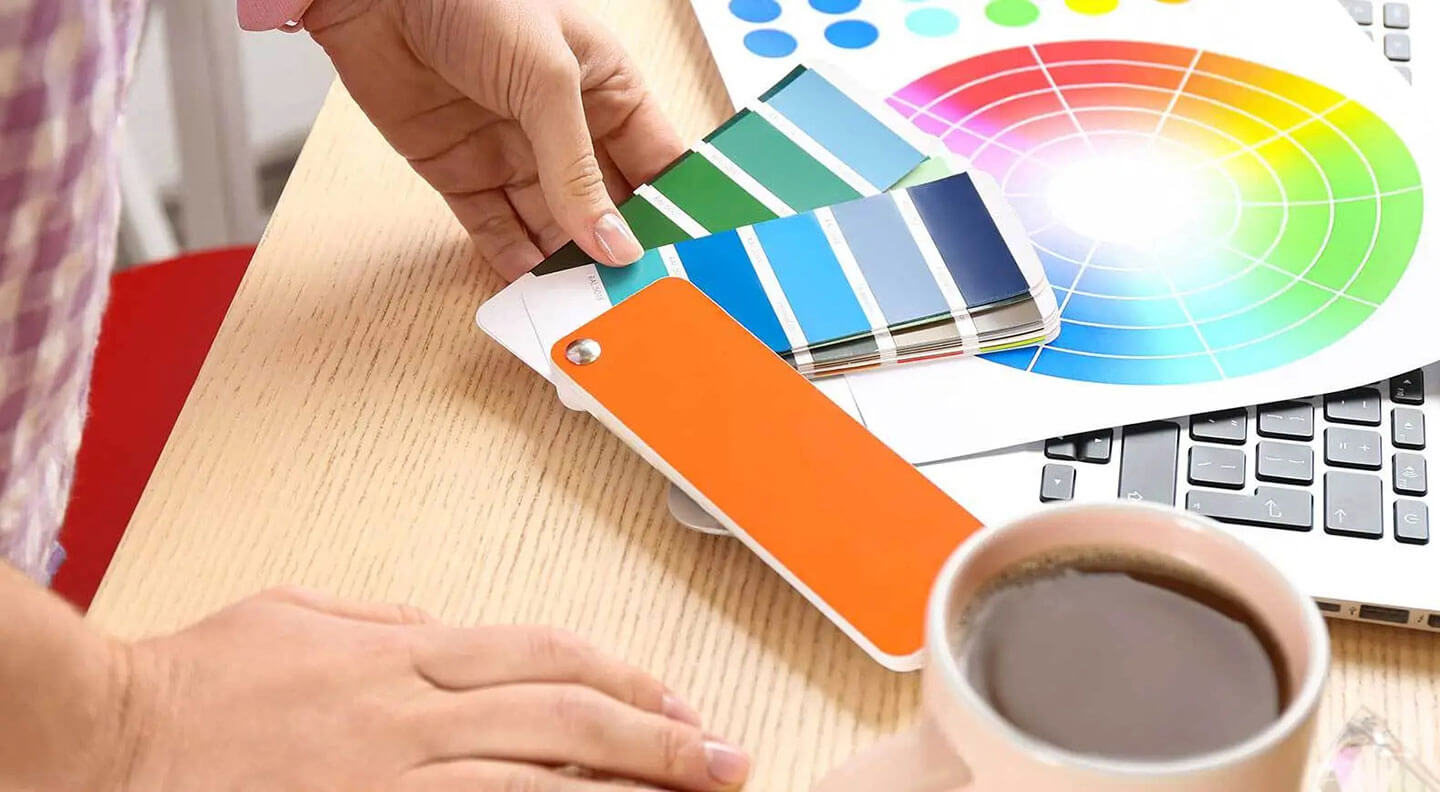
The Power of Colour Psychology and Spectrum in Logo Designing

Colours evoke emotions and convey messages in some way and humans’ fascination for colours doesn’t fade away as they grow up. If this wasn’t the case, a logo’s dependence on colours for a strong visual identity would be zero. Brands need logos to establish a connection with people and logos need colours. Colours can boost brand recognition by 80 percent and why not?
After all, colours communicate with consumers and stir emotions on a subconscious level. As an enterprise, you want to evoke a certain kind of emotion to create a perception around your brand. This is where colours and colour spectrum come into the picture. Logo design companies optimally use colour psychology all the time while creating graphics and even logos.
Understanding Colour Psychology
Colours have a massive impact on people’s behaviour. They evoke different feelings and emotions in the viewer. Colour psychology is a scientific field that analyzes the effects of different colours on human behaviour and how they influence their feelings, emotions, and decision-making.
Colour perception is more subjective; however, speaking of colour psychology there are some effects with a universal meaning. For instance, colours on the blue side of the spectrum are often termed as calm. Green, purple and blue fall in this zone of the spectrum. Colours in the red area of the spectrum such as yellow, orange and red tend to evoke emotions of warmth, love and comfort.
Every brand is different in terms of its offerings and USP (Unique selling proposition). Their uniqueness must reflect in their branding and hence the importance of colours. Although there is no specific formula to choosing an emphatic colour scheme for your branding, you need to understand what kind of feelings each colour evokes, to begin with, and what your brand identity system strives for.
So, while you rack your brains for impressive logo design ideas, it makes sense to know the different colours commonly used in logos.
Blue
Since the year dot, blue has been a hot favourite of marketers. Generally speaking, often associated with calmness, confidence, trust and security; blue is used to design attention-grabbing logos in a wide array of industries primarily IT, healthcare, finance, and energy to name a few.
Look around and you will see some of the biggest brands using blue logos. Here’re a few renowned brands using blue-coloured logos.
- Skype
- IBM
- Ford
- Dell
- American Express
Creative logo design firms, however, point out a small problem with choosing blue as your primary colour. Blue is so commonly used by so many brands that it becomes difficult for you to make it stand out unless you make a truly attention-grabbing and creative logo.
Orange
Mastercard, Gulf, Fanta, Firefox and Soundcloud are some of the brand names that come to mind when thinking of orange logos. Orange is an apt colour because, one it stands out of the crowd with sheer ease and two it evokes a sense of playfulness. Orange exudes energy and that’s why brands use it to establish trust with cheerfulness.
It is important to not get adventurous with this colour as it is a warm colour and when not handled correctly, it might come across as harsh to the human eye. This is the reason you’d find most companies showing an inclination to peachier tones.
Orange logos are ideal for brand logos of primarily food & beverages, art & entertainment, home décor, and fashion to name a few.
White
White is more of a complementary colour that’s used to create negative space in a logo rather than using it as a primary colour. The impact of white cannot be undermined and that makes it a preferred colour.
Tesla, FedEx, and The North Face are some of the globally recognized brands that made logos with white colour quite popular. When used in a logo white can evoke sincerity, purity, and simplicity.
Black
Extremely popular amongst luxury and lifestyle brands as this phenomenal colour makes logos strong, captivating and attention-grabbing. It is often associated with elegance, sophistication, seduction and luxury.
The gamut of brands using black logos runs infinite. Nike, Louis Vuitton, Adidas, Sony, Puma, L’oreal and Prada are just a handful out of countless global brands that leveraged the power of black to make their logos stand out with elegance and pride.
Red
Mostly used in advertising, Red is the second most popular colour after blue. Usually associated with love and romance, red is also used in logos to denote passion and modernism.
If your brand archetype is youthful and contemporary, red is a good primary colour choice for your logo. You would often find restaurants and food brands using the colour red. Since red effortlessly catches the viewer’s attention, it is also used in marketing campaigns to stimulate emotions of urgency.
Netflix, Coca-Cola, YouTube, Canon, and Oracle are some popular brands using red logos.
Yellow
Yellow is another warm colour that lies between red and orange. It is used by brands that want to connect with their audience with warmth, youth, and friendliness. You should rather use gold shades if the products are high-end. Often associated with travel, leisure and energy; yellow is used by Subway, Nikon, National Geographicand McDonald’s – to name a few.
Understanding Colour Spectrum to Choose the Right Colour Palette
Logo design companies use the colour wheel to come up with a perfect colour combination. There is a lot more to choosing a colour palette than merely finding a good combination of colours. Coming up with colours that perfectly reflect the traits and personality of your brand will do a brilliant job in establishing that much-needed connection with your target audience.
We will help you understand the science behind colour combination and of course the relationships between colours on the colour wheel.
The colour wheel is the most prominent or authentic guideline in colour theory. Usually, primary colours are used for the logo symbol while secondary colours on the colour wheel are used for business description, tagline or logotype. Yes, you can get a little creative with this and rules can be broken which isn’t bad at all so long as you know what you want to achieve and it is successfully being accomplished with that combination.
As a general rule of thumb, use a maximum of 3 colours in your logo.
Play with different shades, hues, and saturation till you find a combination that works. You also have to take into account how the colours look in digital and in print. What looks awesome in digital might not necessarily look equally appealing in print. But why does this happen?
A colour picked from RGB space might not demonstrate consistency in print, simply because it is missing in CMYK space.
Logo designing is finding the right combination of colours that showcases your brand persona. Besides, all these colours must remain consistent across all media such as signage, printing, packaging, and digital.
The Bottomline
Colour is one of the most important considerations while designing logos and creative logo design firms consider colour psychology and make optimum use of the colour wheel to come up with brilliant and out-of-the-box logo design ideas that perfectly reflect the personality of your brand.


