Let's Talk
We would love to hear from you. Want to know more about our services or have any questions? Say Hi!
What Must Come First: Copy or Design?
It’s the classic chicken-or-egg dilemma
What’s the strategic place to start? The COPY or the DESIGN when you’re creating marketing collateral for clients?
….Because if you start with the “wrong” element, would you not mess up everything?
If you are running a small business with a limited marketing budget, obviously, your concern would be – should I spend it on design first or the content?
That’s a legitimate concern.
We love it when clients put this poser to us with an open mind. Unfortunately, we don’t have an answer. Like that old chicken and egg scenario, there is no right or wrong answer to this copy vs. design dilemma.
Can you get away with poor copy if the design looks great?
I am afraid not.
And…can you present a compelling copy that can close a sale, if it’s poorly presented?
The answer, my friend, is again a resounding ‘No.’
In my opinion, this battle between copywriters and graphic designers arises when you’re creating material from scratch, and especially when the client doesn’t really know what he/she wants from either the copywriter or the designer – which happens more often than you can imagine? but that’s okay because that’s the reason for hiring either one of us.
But the issue is there is no brief in hand and you have no choice but to start shooting in the dark.
In our experience there can be pitfalls whether you are taking the content-first or design-first approach. Designing without copy can lead to a beautiful piece that misses the mark in conveying the appropriate message. On the flip side, composing copy without a design can lead to not enough words or too few words for well-designed material. In both cases, you end up compromising on the user experience and potentially fall short of accomplishing your marketing goal.
Design and copy also complement each other, paper over each other and make the circle complete. If a design is very overwhelming, the less said the better. More is really a waste of breadth, if the design is the dominant feature. But if the design element of an ad is weak, the copy can emerge stronger and set the two sailing over the choppy waters.
Did you see the recent print ad for Linovo’s smart phone, Vibe X? It has this intense-looking, girl-next-door in a minimalistic shoot-and-design setting with the copy that reads, “Blend In. Stand Out. None of the Above. Conformance is a burden I choose not to carry. That’s me. That’s my vibe.”
There is really nothing left to be said.
As in Nike’s – Just do it.
The line resonates so well with Nike’s target audience.
As a thumb rule, less is always more. Garrulous is gross.
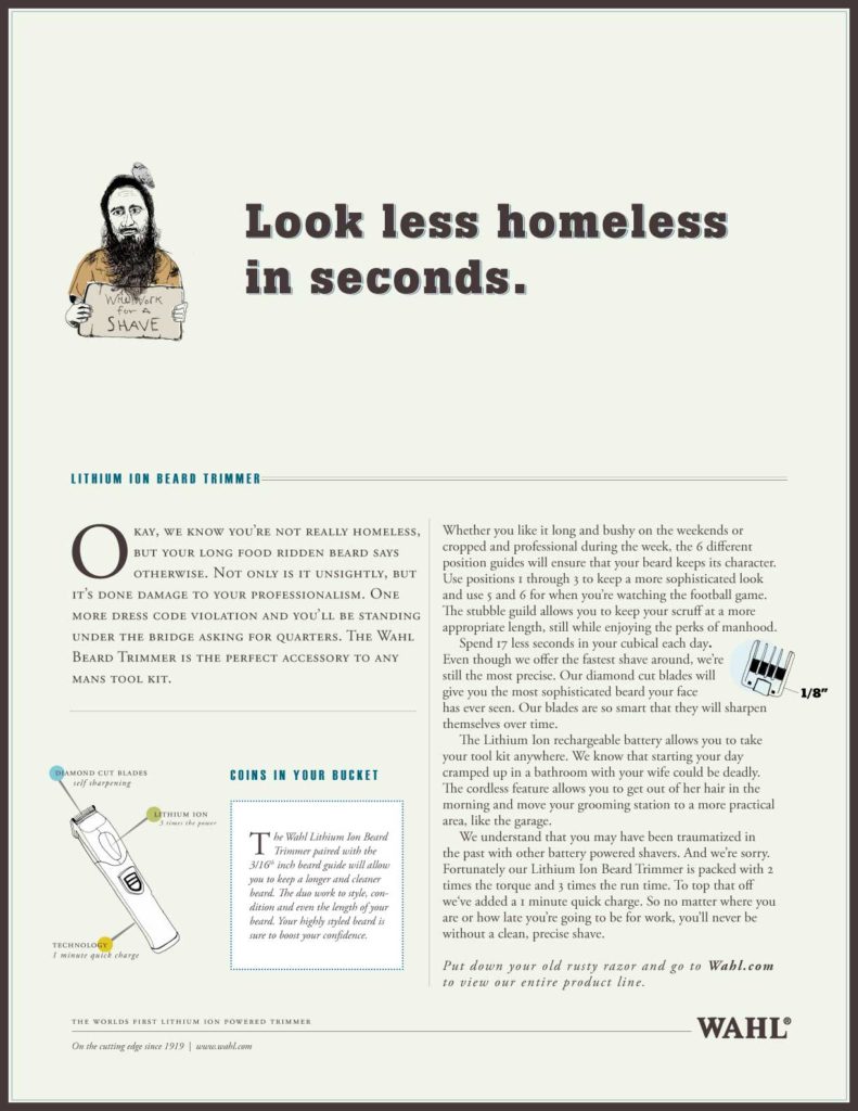
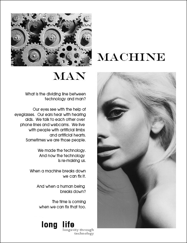
In contrast, the Pantene ad is absolutely minimalistic – I would call it the pregnant (silent) ad, while the copy for Long Life Magazine is so strong, the visuals have deliberately been played down. BTW, it’s a long copy – not as long as for personal grooming brand, Wahl’s razor – but in both cases, it works and the design is conspicuous by its absence.
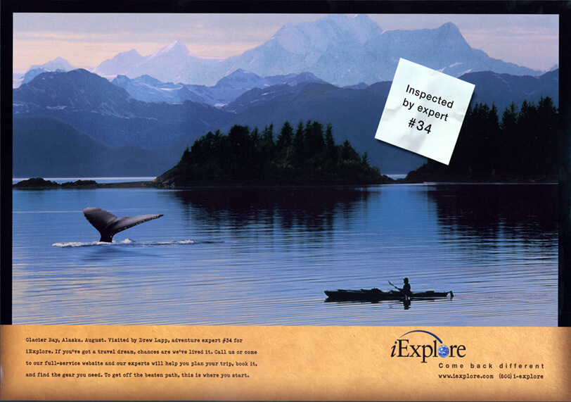
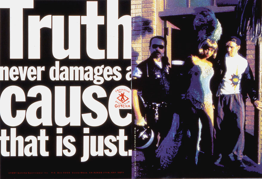
The iExplore ad sells the story of a whale sighting with a whale of a picture, while the Gotcha ad has just the right dosage of punk and spunk endorsement from Mike Salisbury and Tyra Banks.
To sum up, a beautiful design is like a well-dressed salesman – it might get you through the door – but if what comes out of the salesman’s mouth is not sound enough, the door might slam shut tight again!
When a copywriter and a designer partner up, the result could be sheer alchemy and a lot of happy clients. Great design can make a copy sing; while sharp copy can make a design look smart.
Copywriters and graphic designers need each other and need to be in sync with each other in order to create a symphony. What makes a campaign work is when stunning visuals and compelling copy accidently come together. Projects that begin with a concept, an idea, a purpose – a clear brief to the copywriter and the designer – sing from the word go!
Copywriters need to understand how images and layout work, while graphic designers need to understand how a copy flows and can influence design. When the balance is right, customers can identify a brand as much from its graphics as from its tagline – the combination would be worth more than the sum of the individual parts!
