Let's Talk
We would love to hear from you. Want to know more about our services or have any questions? Say Hi!
7 tips to create images that attract & convince your target audience

Visual content only has value when it is what your target audience wants. What concerns most packaging design companies and is how to convey the right message through creatives. Here are 7 tips on how to create images that will attract your target audience and convert them into consumers.
Get the Symbolic Right

The Amazon logo symbolizes trust and speedy delivery with a smile. How does the eCommerce giant convey this message? Two things help them do this contrast, symbolism. The sharp contrast of blue and white is attractive. And then there is the arrow that goes from A to Z. It tells you that they deliver everything from A to Z – virtually everything. The arrow also signifies the smile on the face of their delivery agents and consumers. And finally, the curvature further tells you about the speed with which they deliver.
The point we’re driving here is your creatives should tell the story of the brand you are marketing. Humans learn through association. Symbols inherently have multiple significance, only one of which may be obvious. The subtler the innuendo the more the creative is likely to attract. Such subtle innuendos affect buying behaviour. The name SnapDeal is suggestive and symbolic at the same time. When designing your creative you should think about what will resonate with your buyer persona and how you can tell the story of your brand.
Be Relevant to your brand
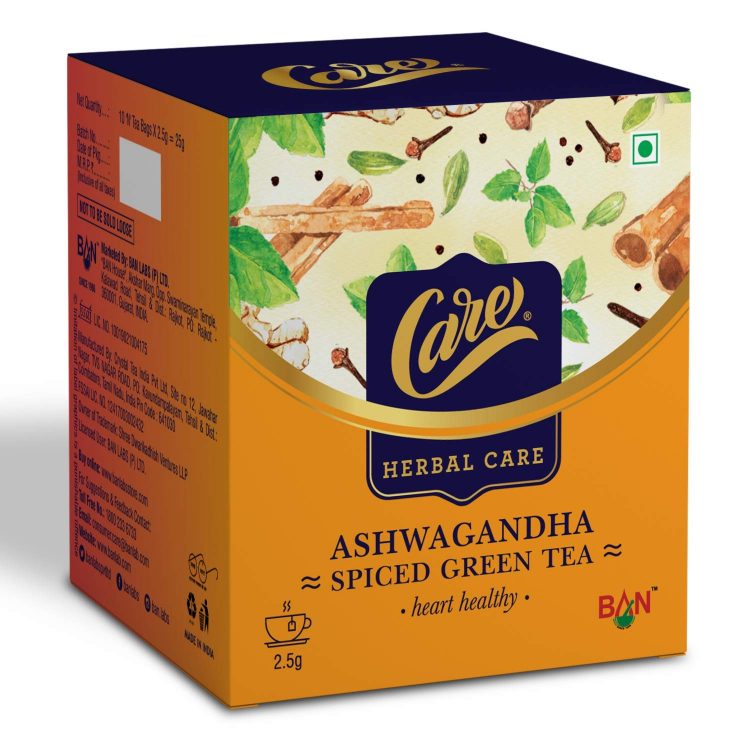
This Ashwagandha herbal tea package clearly relates to nature. Packaging design companies – and other designers too – should leverage such relevance on their creatives.

Natural’s Ice cream makes its tagline relevant to the flavour by the effective use of colour. In each ad, the colour of the tagline is relevant to the flavour. Using relevance in this manner enhances the imagination of the user and compels him to create a complete dream which he wants to experience.
Think Experience not Product

Cadbury has nailed this. From the college fresher having chocolate smeared on her face to the brother gifting his sister a box of chocolates on Raksha Bandhan – don’t miss the red ribbon around the box that is symbolic of a Rakhi – all their advertisements are about the experience of love and joy. Such creative lure the user to have the same experience. They’re suggestive of ways in which you can enjoy the product. How can an anti-roach-gel improve the relationship between MIL and DIL? Yet that’s exactly what the Hit anti-roach-gel 20-dot advertisements suggest. Again think of what will resonate with your target viewers. What experience will they anticipate? Think not of what they have but what they hope to have. The Ambipure advertisement, that talks of dispelling almost any odour is another great example of experience. The idea is to show the user the extent to which they can enjoy your product.
Give them Numbers
The Baskin Robins’ logo is a great example of symbolism coupled with numbers. It symbolizes the 31 flavours they offer. We all know Mark Zuckerberg created FB. Who then is Marcia Zuckerberg? It is the female version of Mark – created exclusively to highlight gender inequality – and it’s supported by stats. Some people are moved by emotion while others love numbers. This Ad of Bruce Springsteen – the famed American singer and songwriter, uses stats effectively. Stats lend credibility to your brand statement. Stats convince your user about the trustworthiness of your brand. A study by Victoria University showed that an image with statistics is more compelling than a stand-alone image or data.
Leverage Copy
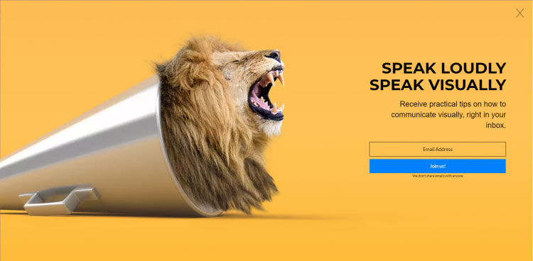
Have you heard of a sugar-free gum that is also a multivitamin? What more could anyone ask for right? Look at how Bulletproof uses this USP in their image and then lets the user say “Show Me” – which is what their button text says instead of the standard Buy Now. You may have great images but they can’t do much by themselves. Supporting them with strong copy is important. Take a look at this subscriber pop-up from Visme for instance. They actually mean what they say – Speak Loudly Speak Visually – like the lion roaring from the horn. Here of course it’s the image that enhances the copy but you get the point. Combining good copy with great images always works.
Don’t forget your SEO
Creative images are a great way to attract and compel the audience. Unfortunately, they don’t mean much to search engine bots – and all your efforts are wasted if your audience cannot see what you have created. So optimize your description for search engines. Don’t forget that users search in multiple ways so writing a great description for your image matters. This will help Google and its buddies figure out what the image is all about and decide whether it is relevant to the search or not. Some of the ways in which you can optimize your images include using a key-word friendly file name, a strong title – think of how you optimize H1 and H2 tags – and of course in your description and alt-text.
Use them for Storytelling
So you have your images, data, and SEO optimized written copy. The trick is putting it all together in a way that tells the story you want to tell. Social media marketing services in India are breaking barriers to the imagination and designing social advertising creative that tells elaborate brand stories – and so can you.
Do you agree? We at Litmus branding – one of the topmost creative designing companies in Ahmedabad, are right here to help and it’s super easy to reach out to us – just click this link.

