Let's Talk
We would love to hear from you. Want to know more about our services or have any questions? Say Hi!
Explore the Appeal of Minimalist Packaging Design

Globally, all the leading packaging design agencies have adopted the new minimal packaging style that’s winning the consumers’ hearts with its charm.
In the current market, it is best to tone things down and develop creative packaging designs based on the core ideas of minimalism if you want to stand out on the store shelves.
By keeping the packaging design free of excess ornamentation, minimalism puts the focus on the product itself first.
Impact of product packaging on consumer buying behaviour
Product packaging is emerging as the most significant marketing tool given the keen competition – not only to grab the buyers’ attention but to retain it and convert sales…..Read more
In this way, the consumer can swiftly assess and comprehend the packaging contents and decide whether the product is a good fit for them.
If done correctly, minimal packaging strikes a great balance between environmental concerns and an overtly simple aesthetic, making it a great alternative to the many other packaging trends sweeping the market at present.
We will examine the magnetism of less is more in contemporary packaging supplies in the following article.
What Makes Minimalist Product Packaging so Impactful?
Modern marketing and advertising have become so intensive and prevalent across all forms of media that the previous methods of standing out are becoming oversaturated in the minds of customers.
Since time immemorial, consumers have long been attracted to packaging materials that feature bright colours, bold claims, and multiple text fonts.
Is cardboard packaging an eco-friendly solution?
Before the 2000’s when plastic became a popular material used in flexible packaging, most packaging items were designed using paper and cardboard……….Read more
While more advanced forms of digital marketing and augmented reality apps are successfully capturing consumers’ attention for a short time, a rising section of packaging materials aims to be the complete opposite of these trends.
Though we are still immersed in a sea of excessive advertising, many of those ads fail miserably in their tasks of engaging consumers.
In an effort to counteract customers’ increased behaviours to reject marketers’ messaging, big ad firms are presenting information in more oblique places.
In light of this, it is not surprising that extreme minimalism in packaging is starting to be seen as a new type of commercial resistance.
It’s hard to notice pure simplicity when everything else on the shelf is so unnecessarily complicated. In a desert of technicolour visual lunacy, a simple white box with one short line of black text stands out like a refreshing oasis.
Minimalist Design is friendlier to the environment
Why Businesses Should Adopt Eco-Friendly Packaging and Ideas to Inspire?
By recycling 16 plastic bottles to make yarn for shirts, shorts and socks, the U.S. National Soccer Team and #Nike have taken recycling to the next level. #Nike claims to have saved about three billion plastic bottles since 2010 by using recycled polyester in its products…..Read More
The recent surge in the popularity of minimalist packaging is also significantly attributed to the style’s generally lower environmental impact.
Numerous minimalist product packaging designs emphasise the use of just one or two different types of materials.
In contrast to extravagant packaging, minimalist packaging designs uses fewer resources during production and have less visual content.
Because there are frequently no extra components, adhesives, or other things that complicate the product, recycling is made simple. Especially with single-stream recycling, which is quite common but frequently made more difficult with mixed materials and adhesives in empty containers.
Due to its streamlined style that makes purchasing easier for the customer and its dynamic quality that is easy to recycle, minimalist packaging connects psychologically, emotionally, and physically with the consumer base in a unique and often spontaneous way.
Breaking Some Myths About Minimalist Product Designs
1. Minimal Designs Are Not Anti-Design
Although minimalism may have emerged as a reaction to abstract expressionism’s dominance, this does not imply that minimalism is inevitable “anti-design.”
Minimalist creative product designs emphasise how to use elements such as font, hierarchy, colour and white space as effortlessly as possible.
Furthermore, minimalism was crucial for the design of way finding systems, which had to be as efficient as possible to convey the necessary information to the observer in a timely manner.
Simply put, minimalist packaging designs would not be minimalist if they did not adhere to the fundamental principles of design; the only distinction between it and complex design is the amount of clutter that is employed to convey the same thought.
2. Minimalism won’t help you stand out
One of the biggest myths regarding minimalist packaging design is that it will be overwhelmed by items with an intricate design focus.
The fact is that many product marketers tend to favour vivid, audacious, and intricate designs because they believe they require an explosive impact to stand out. In practice, though, this could seem counter-intuitive.
Since the market now offers hundreds of different designs to choose from, you’re likely to find aisles crowded with intricate patterns.
But contrary to the popular misconception, despite a sea of vibrant, bold, and intricate designs, minimalistic products are now effectively drawing the eye and closing the sale by providing the information customers need.
3. Minimalistic product designs don’t need colours
Perhaps, when it comes to minimalistic product designs, there is no misperception that is more false than this one.
Colour is still acceptable in minimalism, although it is used much more sparingly. Generally, colour is only used when it serves a specific purpose within the overall design, for example, to draw more attention to certain elements or areas.
Benefits of using a Minimal product design
- Minimalist designs elevate your chances of keeping your target audience engaged by allowing them to quickly scan all the relevant information on your product’s package.
- Instead of using a lot of graphics or patterns on your product label and packaging, utilising minimal designs will put more emphasis on conveying relevant information.
- If you employ a well-thought-out minimalist design, your product will stand out from those of your rivals. Consequently, it’ll result in a boost in your sales.
- Creates a niche and bold look with its features. Conveys a powerful statement with your products while providing them with a luxurious look.
- Minimalist package is not only aesthetically pleasing, but it also empowers you to use less packaging material.
- Minimalist packaging frequently tends to be lighter which can save you lots of money if you offer shipping services to your customers. You can ship your products to far-off regions and save a large sum on shipping expenses owing to their weight.
- Since fewer materials are used to produce minimal packaging designs, it makes them simpler to recycle. It also downsizes the impact on the environment while enhancing environmental credibility.
- Minimalism in packaging helps to shorten the manufacturing cycle time for packaging. Additionally, it helps packaging teams sell products more swiftly and effectively.
How Does Litmus Design Minimal Product Packaging?
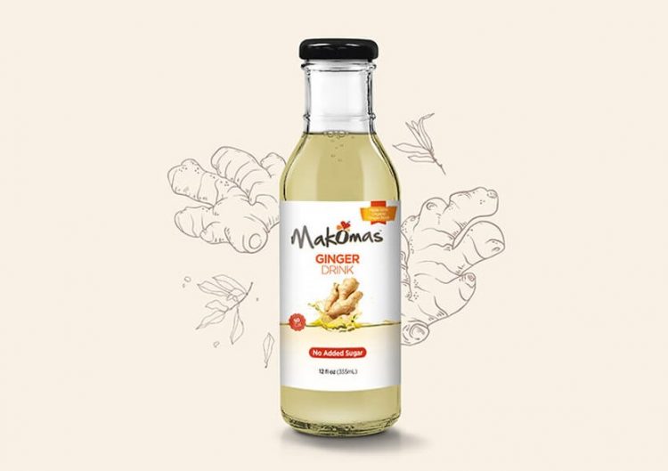
Makomas, an American all-natural beverage brand, wanted a packaging solution to communicate the drink’s natural taste from Africa, its authenticity, and its health benefits to consumers across the country.
After rounds of interviews, research, and brainstorming as a creative packaging design agency we strategically conceptualised Makomas’ minimal product packaging.
On a white backdrop, with their logo on top, we strategically highlighted the primary ingredient of the drinks ( for example- Ginger, Hibiscus, etc.) by placing it at the heart of the packaging.
To go with it, we added just a few details with the copy that represented their health and taste elements.

Makomas’ natural beverage position was communicated directly and sharply to the consumers through this clutter-free design.
In conclusion, it can be said that minimalism in packaging design is more than a fad and is here to stay and prosper.
Packaging design Company are focusing on creating minimalist packaging design for businesses because of its branding benefits so that their product stands out from the other products on the store shelf.


