Let's Talk
We would love to hear from you. Want to know more about our services or have any questions? Say Hi!
Futuristic Creative Food Packaging Ideas
‘Food must be palatable to be acceptable’ – a line from a Science text book that always sticks with the student, well most students.
As a food packaging design agency, at Litmus we believe in looking out for the consumer. The packaging not only should be attractive but also useful. The reason for this is simple. The market for out-of-the-box packaging solutions providers has exploded globally in recent years. Numbers from a well-known agency, Smithers Pica show that its value in the market will go as high as $1 trillion by 2020 – and that’s quite impressive!.
Marching ahead, the industry needs to capture and reflect market trends, as well as consider consumer comfort. We have sourced out some of the most unique and beneficial food packaging designs for this blog, namely from, Top 19 Food Packaging Design Examples For Your Startup by Henny Kel of Designhill, a food packaging design agency.
A Fade Smart Indicator as a Time Barometer
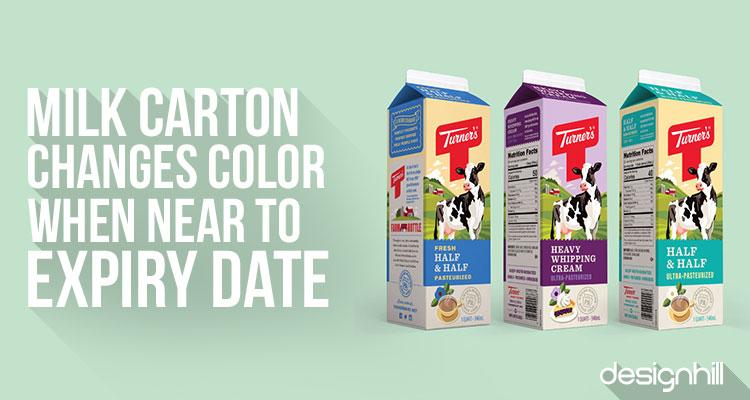
How about a colour-sensitive milk carton that at one glance gives away the food product’s limited shelf life? The way the carton has been designed with a lot of technological input, the colour on these cartons fade off progressively with the passage of time. At purchase point, it would be bright and colourful. The new design makes the milk carton a freshness indicator
Source: Designhill
TOGO burger
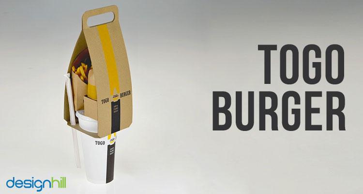
The name says it all! Winner of the core77 Design awards in 2017 is still alive and kicking in public memory. A student project by Seulbi Kim was recognised for its innovation in the field of food packaging. A right blend of convenience, creativity and knowledge, the image sample designed by Kim used less paper and less clutter and an option for easy transportation. A complete win-win!
Source: Designhill
Blossoming Tea Bags
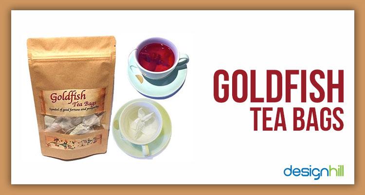
Samova tea making company has come up with the idea of an innovative packaging that informs brew time. Stick to the time and you will see magic unfold. After dropping the tea bag in piping hot water, the paper pores gradually expand and an origami flower unfolds in perfect harmony with the infuse time.
The artistic packaging design of Samova tea prettily releases the energizing flavours of the beverage making the pack more interesting than the tea inside.
Source: Designhill
Beeswax Package for Honey!
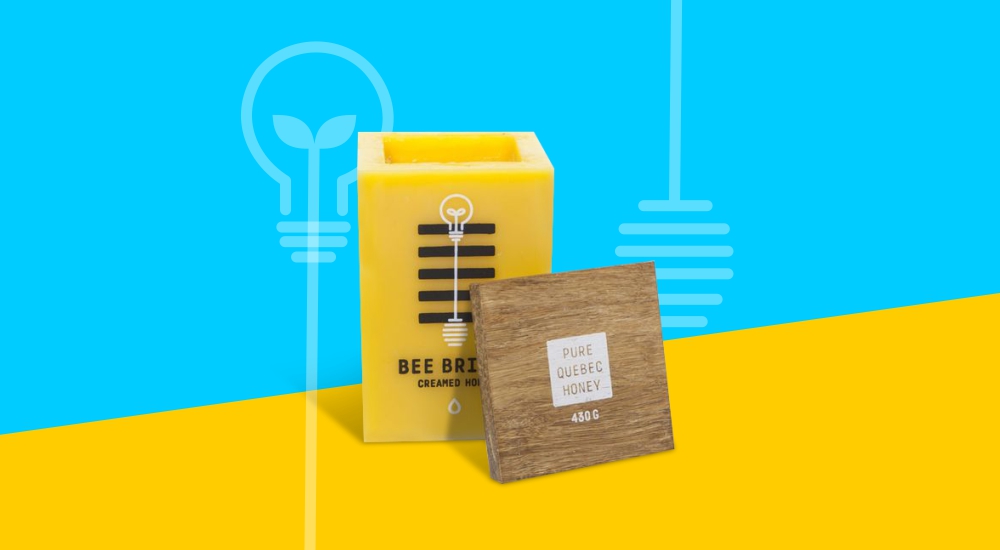
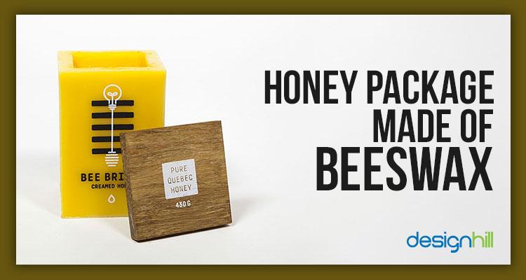
Again, a student project of Maude Paquette-Boula can be a cue for commercial idea to food packaging design agencies. The sustainable packaging solution uses hundred per cent bee wax in its packing. Once emptied, the pack can be turned upside down and be used as a candle. Zero Wastage!
Source: Designhill
Hay Heat-Pressed for Eggs Packaging
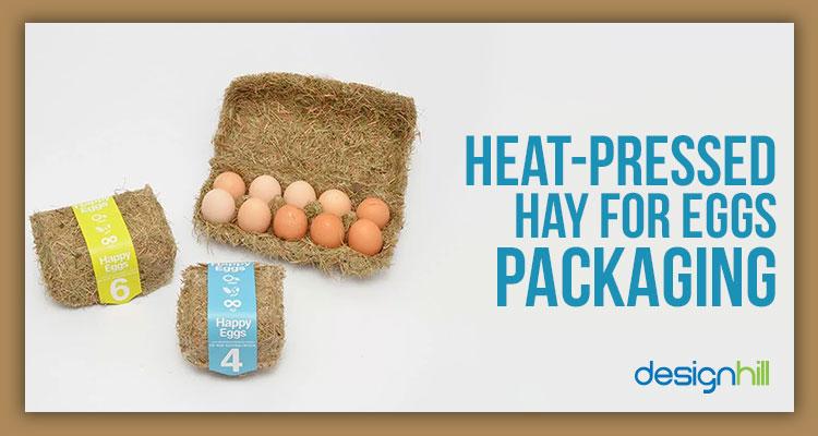
Sustainable boxes for egg made out of hay, heat-pressed into carton shapes – Wow! The brain child of designer Maja Szcypek has already found commercial success. The pack is appropriately called ‘Happy Eggs’.
Source: Designhill
Ketchup Pocket for a French Fries Box
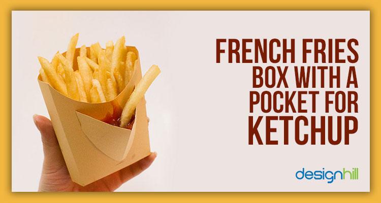
Little pocket french fries box by Dong Jiang-uestc, Zhongshan institute is an award winner in packaging design category for 2016-2017.
Source: Designhill
A Can of Chips that Transforms into a Bowl
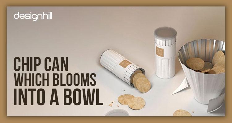
Bloom Chips is a wrinkly package that spreads itself into a bowl, a winner of Red Dot Award designed by Dohyuk Kwon. While eating out of a Pringles tin, he found that it was difficult for his fingers to dig deep to reach the last lot. A lesson for any food packaging and design agency in the world.
Source: Designhill
Cups You Can Eat!
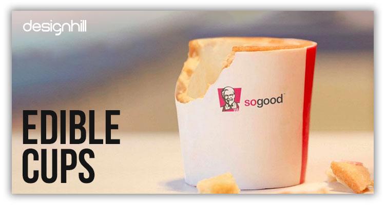
KFC is testing a cup made of edible ingredients, such as wafer, paper and white chocolate. “We thought about how we can make this moment even more special,” expressed KFC spokeswoman Jenny Packwood. The Robin Collective, a food packaging design agency devised the concept reported by CNN Money in KFC tests edible coffee cups.
Source: Designhill
Oil Paints Chocolate Box!
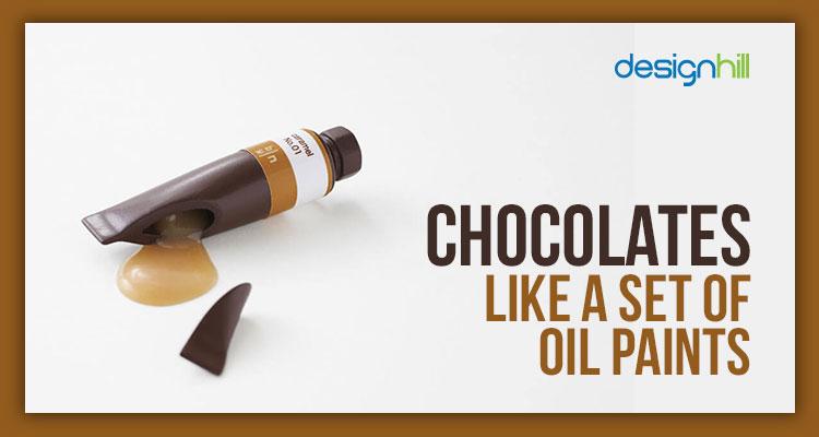
The packaging was created by graphic designer Nendo for Seibu department store in Japan. It happily looks like an assortment of oil paints. But, wait! The paints are edible!
The packaging holds chocolates that are tube shaped, juiced out from different flavours of edible syrups along with a tag acting as a wrapper. One grips the wrapper while eating so that the fingers don’t get dirty.
Source: Designhill
Last words …. Happy Healthy Packaging? Drop by at Litmus Branding for more stimulating ideas.

