Let's Talk
We would love to hear from you. Want to know more about our services or have any questions? Say Hi!
Get Creative with Billboard Ads
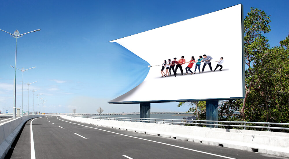
Imagine yourself cruising on a highway….comfortable yet completely focused… enjoying some nostalgic hits, blaring out of your speakers.
Suddenly out of nowhere, you see this overwhelmingly cheesy pizza, absolutely irresistible… about the size of your car.
The picture on the ad reminds you that you have been starving, even if you are not.
The next thing you arelooking for is a place where you can get that pizza.
Now, that’s the kind of power a billboard ad can have… absolutely magnetic.
Billboards don’t just catch your attention; they capture your attention.
Creativity in billboard advertising lies in creating a memorable impression that remains on the mind of the viewer even after he has driven past the billboard ad.
All you have is a few seconds to create this impression, given the fact that the billboard would be read while passing at high speeds.
The ad needs to be huge, with an arresting or humorous image printed in brilliant contrasting colors.
The words should be in large print, few in number(keep it to a maximum of six words) and readable in a super short time.
Billboards need to be noticed; but they cannot distract audience
While you want to get your message across, you don’t want your billboard to be the cause of major or minor accidents on the highway. That said there is nothing to stop you from putting up billboards on buildings in city spaces. This way you can get your viewers to spend more time reading the message.
Billboards are the best way to target audience based on location. The best part about billboard ads is that they are there 24/7. You cannot imagine this kind of exposure when it comes to newspaper ads or TV commercials.
That’s not all. There is another great advantage in billboard advertising – it is absolutely affordable. So, you can actually think of putting up more billboards and get better visibility.
Another way to make your billboard interesting is to have 3D images or moving parts on it. It would be a great idea to have people interacting with your billboard. No one said billboards need to be simple print ads. They could even be interesting animations. So just go for it.
Competing in this tough advertising market requires a great deal of creativity. It is not easy to capture the attention of a mass audience. Yet there are a couple of companies that pulled it off perfectly. It is less about money and more about creativity and intelligence. That’s how they came up with meaningful ads that could absolutely blow the minds of the viewers.
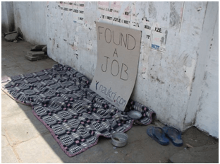
With this ad, Naukri.com surely proved it to the world that outdoor advertising is not about spending too much of money. If you are smart, you can have your way.
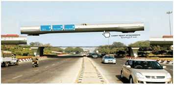
If you thought this was an interchange have a look at the ad again. It is Yahoo’s way of saying it can carry heavy attachments in its mail. Brilliant… isn’t it?
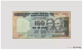
If that didn’t leave you amazed, how about this joint account proposal by Union Bank? Creative enough?
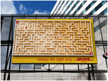
DHL came up with this huge 3D billboard on which a small red ball starts rolling from point A to point B. Once it finishes the journey passing through the shortest route on the maze, the ball is transported back to the top of the billboard via an invisible conveyor belt. Very aptly DHL words its ad – “Again and Again, yes, always the right way.”
Billboard ads are not always about creating awareness about your brand. It could also be about social messages. Here is one such ad that talks about domestic abuse.
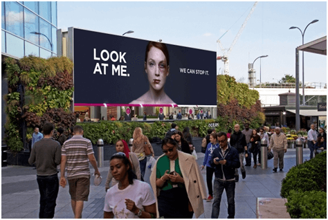
Created by Charity Women’s Aid, this interactive ad features a picture of a woman who is beaten and bruised.
The idea was to make sure more and more people stopped and looked at the poster. As they would do that the injuries on the woman’s face would disappear.
This experimental marketing ad was a part of Masters of Marketing Award-winning campaign that aimed at making people stop and taking notice of the issues.
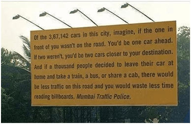
One thing that billboards can’t have is too much text. Still Mumbai Traffic Police came up with this long text billboard ad to reduce traffic on the road. Although text was all that it contained, it did its bit in putting things into con’text.’
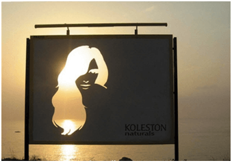
This billboard of Kolestron was a nice way of emphasizing the natural look of Kolestron colored hair.
The billboard featured an unspoiled view of the skyline along with the sea behind it. The hair of the woman was die-cut so as to capture the variations of the hair colors in the different lights of the day and night.
When compared to the other types of advertising, billboard advertising needs to compete against extreme distractors. On one side there is the speed at which the viewers are driving on the road. On the other hand there is the legibility of these ads from a distance and the open roads that are potentially dangerous. Many designers have come up with a number of rules and practices to overcome these challenges. However, such things have only led to uninteresting approaches.
Here is an interesting technique to make sure your billboard ad would be read and understood by your target audience:
Get your billboard printed to the size of a regular business card
Hold this card at your arm’s length
See if you are getting everything that you were when the ad was displayed on the 27” monitor. If not, you may have to refine your ad.
Remember – the ad needs to pop and you only have a few seconds (5 to 10) to get your message across. So keep it as simple as you can, while making it colorful and eye-catching.
One thing you can be sure of about billboard ads is that they are here to stay, at least for a couple more years. Digital might be taking over; but as long as there is traffic on the roads, billboard advertising will not lose its charm.
While billboard advertising has its own set of challenges to overcome, it does give you an option to get increasingly creative. So give it your best and get going.
