Let's Talk
We would love to hear from you. Want to know more about our services or have any questions? Say Hi!
How Packaging Influences Consumer Behavior to Generate More ROI
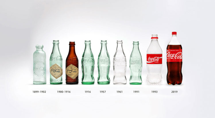
They say the first impression is often the last impression. This is certainly true with product packaging. You cannot judge of the exact quality of the contents from its packaging but there is no denying that you can still get a fairly good idea of it. That’s what makes it a very powerful branding tool. Attractive packaging design will draw consumer’s interest at the Point of Sale (POS) and he/she will feel inspired to buy it.
The Color Connection
#Yojoki, a Japanese tea company is a fitting case in point. Their teabags come packed in an intricately-painted paper box, which is very Zen-like. The floral patterns are very minimalistic, like the Japanese Haikus and immediately evoke feelings of relaxation.
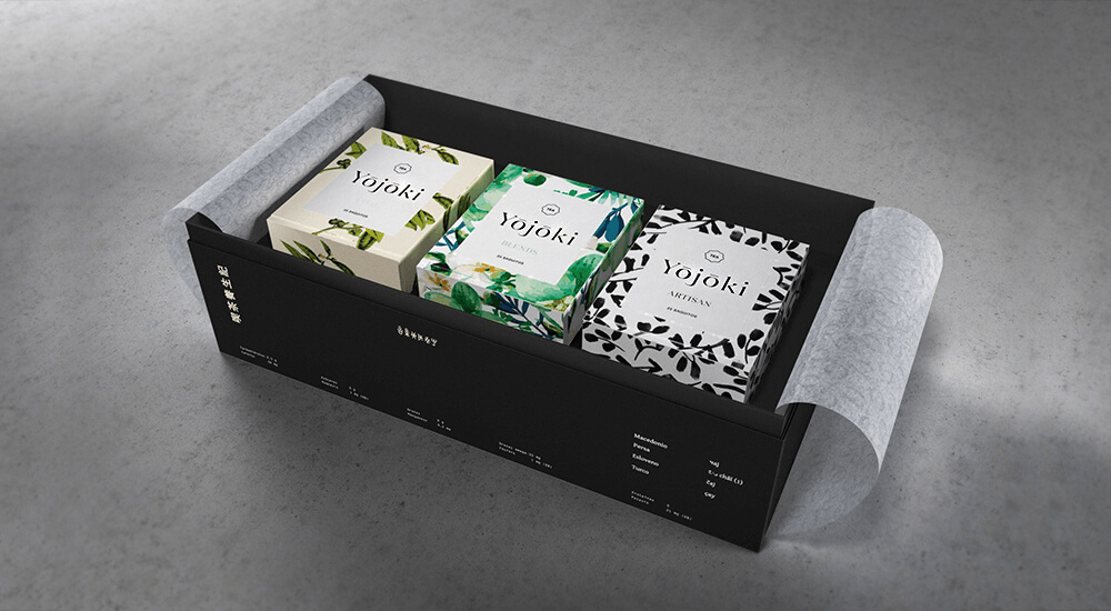
The whole concept looks elegant, and is not just a wrap but a value-add to the brand perception of a hi-end tea.
The same effect can be seen in the packaging of premium bean-to-bar chocolate brand #ManosdeCacao. Mexico-based agency Anagrama combined handmade textures with a vibrant colour palette and clean layouts to give a sophisticated look and feel to the brand, besides “evoking an appropriately organic undertone,” observes Jane Porter, a guest writer for Entrepreneur.
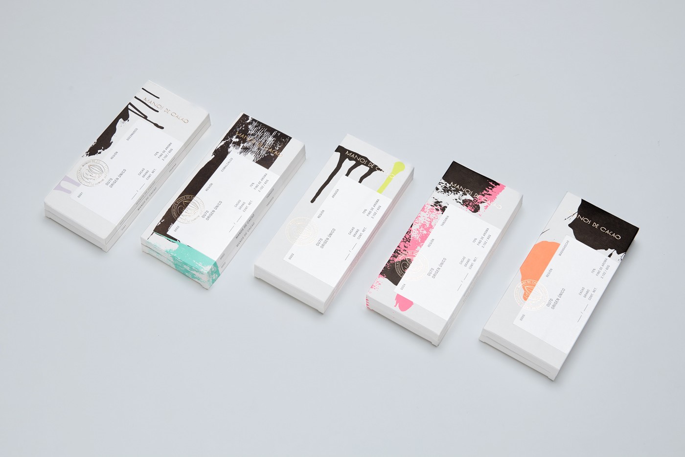
Image source: Heydesign.com
“Small companies may lack the marketing dollars and visibility of larger brands, but they can still stand out on the shelf by thinking outside the box—literally,” she says.
An important aspect to remember is that the elements of brand identity, graphics and color palette should remain uniform and consistent for strong recall. For instance, the moment you spot a red with a white swirl, you know its Coca Cola. Likewise, colour purple is instantly associated with Brand Cadbury. These brand-specific elements are what differentiate one product from another.
They all convey a subliminal message that is instantly recognizable for the target customer. Indeed, the use of a particular colour, should be driven by a marketing logic. For instance, bright colors attract children and neutral shades draw luxury buyers. Colour green or blue are a hot favorite with the health and wellness industry.
Brand Positioning
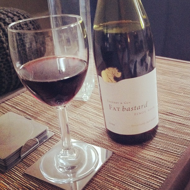
Image Source: Instagram
#FatBastard doesn’t really come across as the name of a fancy French wine. Yet it was strategically used with a cool packaging design to appear provocative to the American consumer and the gambit paid off with the result that today it captures 10 percent of the French wine market in the U.S.
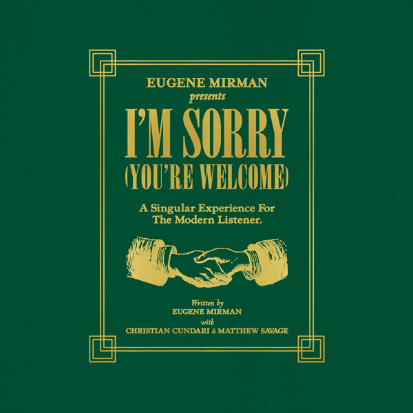
Image Source: Subpop.com
Likewise music company Sub Pop Records got Jonatha n Daly, a fine artist to create an album cover for comedian Eugene Mirman that simply stood out in the clutter, which broke all records and became sort of embolic for the Indie music market.
Packaging in fact is the easiest way to stand out in a crowd, before making a differentiated offering, launching a new product or making a different kind of a marketing stir. It creates an instance bond with the consumer and clearly communicates the brand positioning. Done consistently, it establishes the identity of an iconic brand.
“Positioning is primarily about being able to maintain a consistent perception and image for the brand in the hearts and minds of the consumer,” writes a blogger for Johns Byrne, an agency that specializes in packaging design.
Packaging Clever Messaging
You may wonder what does a toothpaste brand have to do a pizza brand? Advertising Agency Y&R once designed Colgate-branded boxes for late night pizza deliveries for Colgate Max Night to remind customers to brush their teeth after tucking in the pizza. Did the message go home? It sure did.
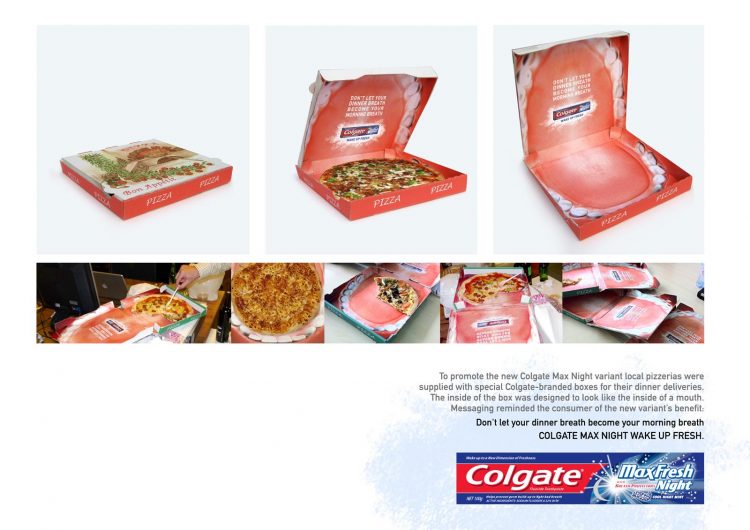
Image Source: Adsoftheworld.com
Conveying Product Process
Packaging can also be used to convey a very quality-conscious process used in making an end product. A third-generation family enterprise Hardy specializes in smoked salmon. Their packaging is designed to convey how the smoking process is slow and deliberate. It cannot be rushed, or the product won’t taste the same. The design conveys how from salting to smoking, each stage of the process is executed to perfection, leading to the idea of Hardy ‘Smoked Masterpieces’ as the brand’s tagline.
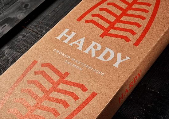
Image Source: Theinspirationgrid.com
Perceived Value of the product
Pricing can also be deftly used to convey the transactional value of a product, whether its premium or mass. “Your design should be aligned with your price positioning: it should tell the consumer what the product is worth,” says a blogger for Ninja outreach, citing the case of an expensive wine bottle, where price tagging is all that one has to do to convey brand premium-ness, essentially because “Perceived value is what consumers think the product is worth to them.”
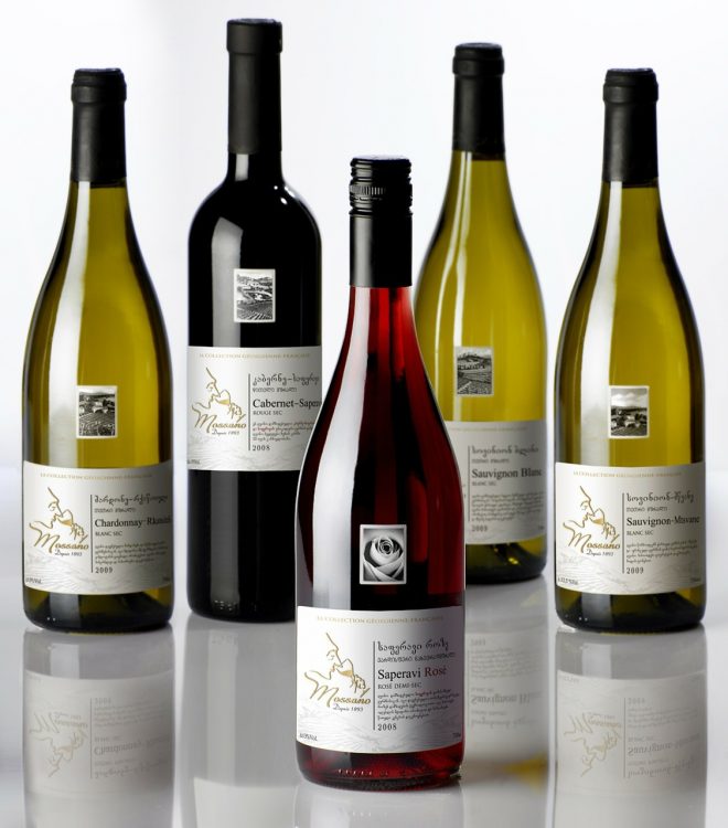
As a concept ‘perceived value’ has a lot of meaning in the luxury selling, which is all about making the customer feel ‘rich’ and good about their purchases, and stir up a huge “emotional surplus” in them, after the purchase is made.
Conveying Excitement
According to a report conducted by the American Psychological Association, a first impression is formed within 39 milliseconds of a brand encounter. This could be the reason why one of the world’s best brands, .#Apple works so hard on developing creative unboxing videos, say earmarking a space at the physical store where customers can rejoice in the unwrapping of a newly-bought product. Imagine one of them feeling so excited as to later post a YouTube video on the “unboxing” experience. Believe it or not, the frequency of posting such videos, with “unboxing” in their titles has gone up by almost 871% in recent years.
Just type in “iPhone unboxing,” and up will get at least a half million hits!
Finally, let’s not forget that packaging is all about working the consumer cognitives through design. The more you understand your consumer, the better your packaging will be.


