Let's Talk
We would love to hear from you. Want to know more about our services or have any questions? Say Hi!
Pause and Ponder

The best print campaigns make you do your own think. We pick the best that came out of 2014.
The Year of the Horse, 2014, saw some extremely good print campaigns coming out of the stables of advertising gurus. At the fag end of the year, they demand a recap. Who knows, if at the end of the exercise, you might begin to ooze with inspiration for your next print campaign.
Some of these ads carried clever tongue-in-cheek lines that make me smile. A few made us wince in pain. A few others caused me to smirk. While a rare few made me take a hard look at myself and think – really THINK. These were the ones that I responded to at a deep, guttural level.
The Crisis Relief ad is a case in point. I kind of feel flattered when a brand does not insult my intellect (That’s a bit pompous, but what the heck!) by presenting a pop show, or below-the-belt, tasteless humor. This one certainly did not.
A Christian disaster relief organization, operating out of Singapore, Crisis Relief ran a volunteer recruitment campaign in 2014 that cocked a snook at today’s social networking, crowdfunding, New Age youth with the copy saying, “Liking Isn’t Helping. Be a volunteer. Change a life.” Winner of a Gold Press Lion at Cannes, Crisis Relief’s stark truth were presented with stunning black and white photographs, superimposed with “thumbs up” signs that rattled me as a net addict. It made me search my own conscience!
The campaign pressed a real pain point – people talk big, but don’t really help – and that cut ice.
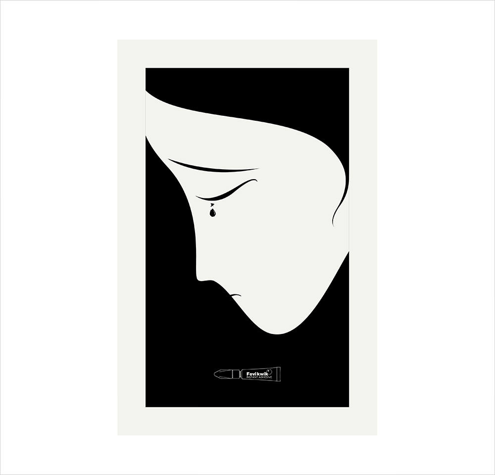
The next on my list is Ogilvy One’s work on Fevikwik, the instant adhesive brand. To my mind it’s poetry in simplicity. Entered at Kyoorius Designyatra this year, it presents simple, black & white graphic posters to show that when an object you love breaks, it breaks your heart. But this heartbreak can be easily fixed with Fevikwik. Nothing earthshattering about the copy, true, but the visuals did all the talking.
I am all for quirky ads that come with extremely slim copy. However for the concept to work, the image has to be larger than life, yet not overwhelmingly so – and that’s a litmus test (pun intended).
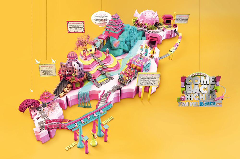
Another print campaign I’d like to point out is yatra.com’s ‘Come back richer.’ The campaign depicts how traveling makes a person richer- in experience, memories, learning etc. To bring the idea to life, McCann Erickson Mumbai designed three board games in 3d, showing three exciting travel destinations- Spain, Japan and Egypt. Out of the box? I would say so, as playing a board game gives almost the same high as traveling to a far-off, exotic land.
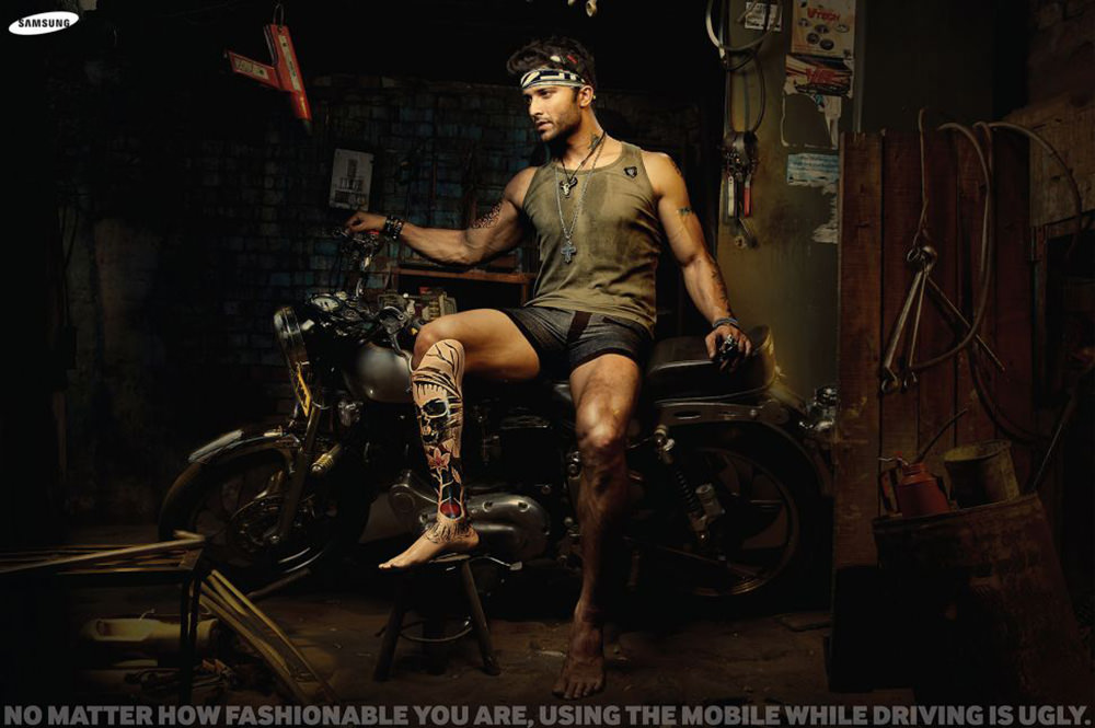
Another on my list is Samsung’s campaign created by Cheil Worldwide India that warns against the dangers of answering a cell phone while driving. “No matter how fashionable you are, using a mobile phone while driving is ugly,” reads the copy. Not quite a selling point for a phone brand, you might say – but it makes a mark, definitely!
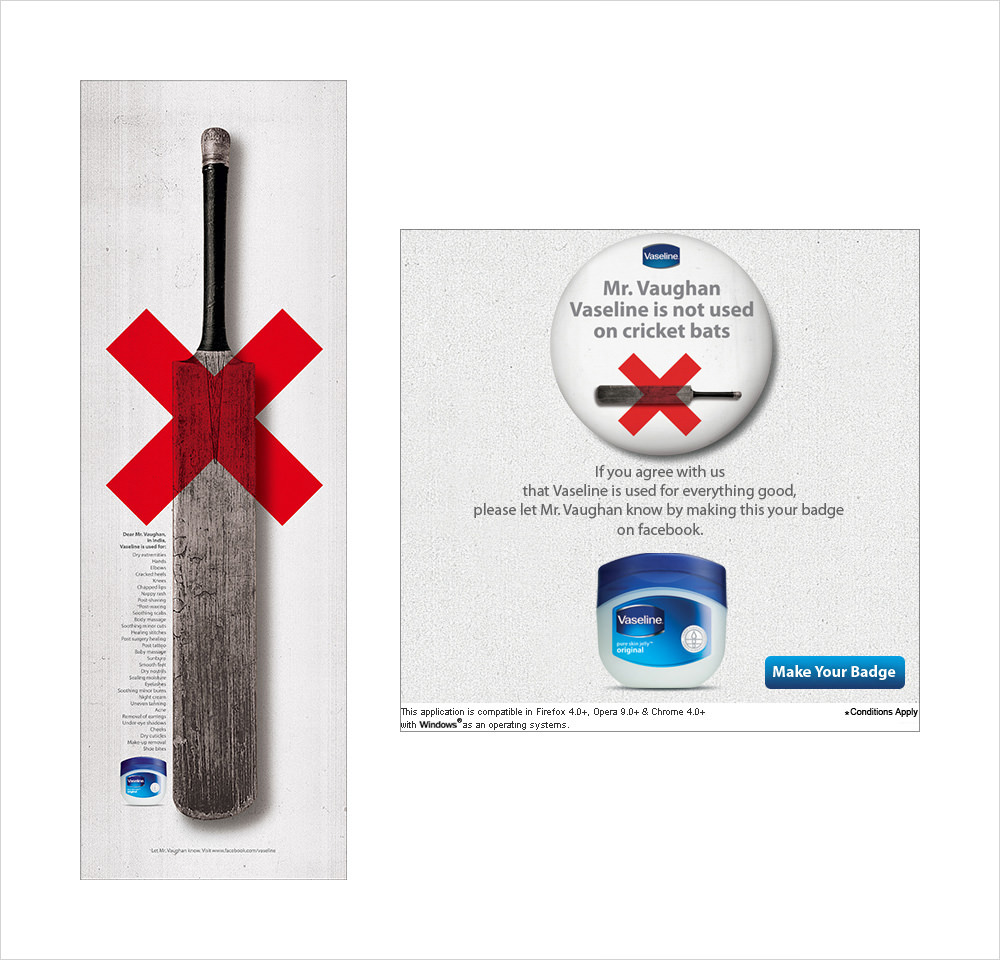
The Vaseline ad created by BBH India also left as few ripples on my mindscape, when I stumbled upon it in ToI’s sports page. Inspired by a tweet by former cricketer Michael Vaughan, where he charged that Indian batsman VVS Laxman used Vaseline on his bat to dodge Hot Spot cricket technology,” the ad responded with a cheeky line, “’Mr Vaughan, in India, Vaseline is used for: dry extremities, cracked heels, elbows.”
That, to my mind is a thinking man’s ad.
Fact is, today’s print ads makers have to work overtime on all frontiers of communication. They have to break barriers, stir still waters, create awareness, build loyalty, and answer the demands of their medium in making a viewer stop, sigh, reflect and think. Done right, and minimally, print is still the most authentic and effective of all communication mediums.
What do you say?
I’d love to start a debate on this point.
