Let's Talk
We would love to hear from you. Want to know more about our services or have any questions? Say Hi!
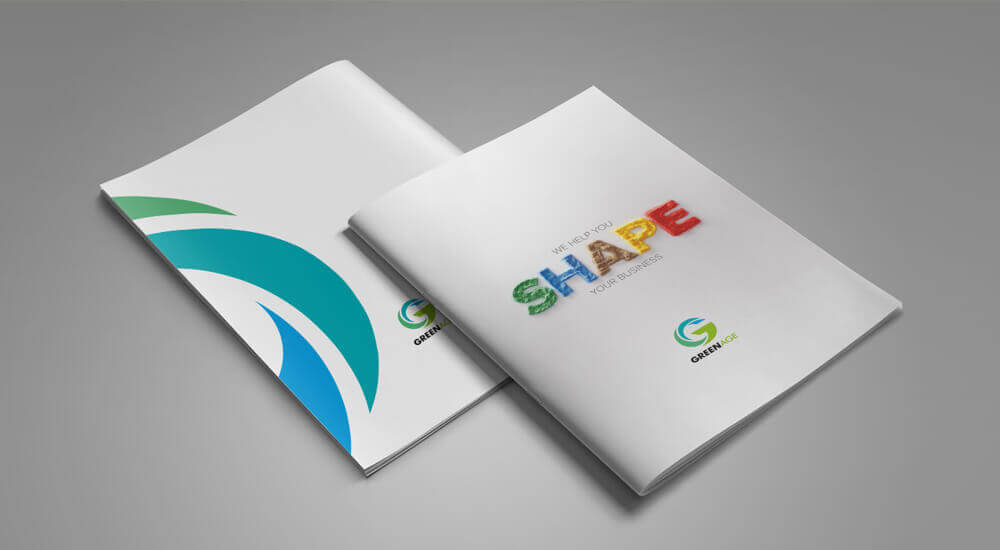
Brochure Design, Simplified

We keep receiving brochures from many businesses every day. They are all usually different; yet there is one thing that is common among them – they are all boring!
They are packed with so much information that you often feel you are reading a text book.
The content, although important for the business, doesn’t do anything to keep its audience interested and engaged.
This contradicts the main purpose of creating the brochure. What is the use of all that content if no one is going to read your brochure?
A brochure is the first ever marketing material that your potential clients come in contact with. It is something that introduces your brand, while letting your prospects understands who you are, what you do and why you do what you do.
Your brochure has to make a good impression on your prospects if you want them to pick it up from your company’s waiting hall or even an exhibition venue.
One thing you should never underestimate is the kind of power a brochure can give you. As per a survey conducted by DMA (Direct Marketing Association), 48% people who received brochures (leaflets) actually responded to the advertisements. They actually paid a visit to the store and purchased the products that the leaflet advertised.
38% kept the flyers for a couple of weeks while 13% kept them for more than that.
A brochure is said to be well-designed if it can convey the brand message to the viewers clearly.
The same brochure design would be successful if the people who receive it would want to read it from the beginning to the end.
It is not only about the design; the content of the brochure also has to be engaging enough to drive customers.
It is quite unfortunate a fact that many brochure designs go completely against these basics. This way, all those efforts of the businesses to attract their potential customers go down the drain.
A brochure should ideally summarize what you do and include a brief about the products or services that you offer. This crucial marketing tool can actually increase the loyalty of your customers if designed well. Professional and creative, brochure design can take your business to a much higher level.
The main power of a brochure lies in the way it is presented. If it looks and feels good, it won’t be tossed away so easily by your customers. It creates a memorable impression in their minds.
In a world that is being taken over by digital publishing, these paper-based collaterals continue to manage their practicality and importance. All that you need to understand is the right way to put together a useful and compelling brochure.
Basic Principles of Brochure Design
If you want your brochure to stand out in this competitive world, you will have to make sure it connects with your potential customers in a meaningful way. There are a few principles that every brochure design should follow so as to keep its audience engaged and interested:
Keep it Free of Clutter:
Less is more when it comes to a successful brochure design. It is important to break your brochure content into chunks that are easily readable and understandable. Too much copy which is poorly typeset will not work here. You can use illustrations, catchy sub-headings, highlight boxes, bullet points and numbered lists to make it appealing. This will be easier on the eye and compelling enough to read.
Include captions with images:
Images are an integral part of a brochure. But if you want them to capture the attention of your potential clients, you will have to include captions that explain what these images are all about. As per eye-movement tests, Captions are the first things that people read. They increase the engagement value of the brochure.
Add value through benefits:
No potential customer would be interested in knowing who you are and what you do. It is all about what is in it for them. You will have to build your case starting with the benefits that you can offer to your customers. Step into the shoes of your customers. Find out what they will get by buying your product. Make a list of the benefits and write your copy around them.
Use Testimonials:
Testimonials help people connect with your business. Your potential customers will relate to the experiences and reviews described in these testimonials and influence them to make their decisions. Coming from the mouth of people just like them, testimonials make your brand seem credible to your prospects. They provide the reassurance that your prospects need.
Use the front cover as an advert:
You will have to give your audience a reason to read your brochure. It is the front cover that will be this reason. Use it as an ad. Put up a teaser message, an intriguing question, an irresistible offer or some amazing statistics that creates curiosity in the minds of your prospects.
Remember your audience:
Your brochure design depends totally on the kind of audience who is going to read it. If your target audience is college students you may want to make it a bit colorful and interesting. If your business is B2B, you may want to keep the look serious and professional. If your target audience includes people above fifty, you may want to make your brochure easy to read. Remember – all that money that you spend on design, copywriting, printing and distribution of your brochure will be worth it only if it is read by your target audience.
Every business is unique and it is this uniqueness that you have to highlight through your brochure so as to move ahead of your competitors. So, start brainstorming ideas…come up with some exclusive designs for your brochure…emphasize the WOW factor of your business…keep your audience engaged, enthralled and waiting for more.
We have years of experience in designing many brochures, corporate brochures, direct mail brochures, business brochures and presentation folders. Get in touch with us to create compelling brochures with interesting graphic designs at cost-effective pricing.


