Let's Talk
We would love to hear from you. Want to know more about our services or have any questions? Say Hi!
Simplicity…. Is it really that Simple?

Learn everything about Making it #DesignSimple.
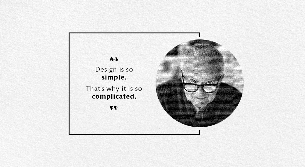
‘Simple’, in the context of design, does it really exist? Or is it merely a mind concept? “Design is so simple. That’s why it is so complicated” once said the legendary Paul Rand, American graphic designer and art director.
This brings us to the question – what does ‘Simple’ mean in the language of design? When designers use the word ‘simple’, they mean something insanely easy to use or is pleasing or easy on the eye.
It could be anything, a corporate identity or a dress design. To elaborate what Paul Rand stated, creating simplicity is a complex process. As a designer, I believe simplicity is the peak for design creativity. My contemporaries collectively agree and propagate ‘this’ idea of simple.
The significance of this discussion rests on the fact the word ‘simple’ is used in the presence of investors and colleagues. They wouldn’t know exactly what it implies in the context of the customer or user experience.
This again brings us to the starting point of our discussion – What does ‘simple’ stand for exactly?
Let’s, crack the code then!
You ask any designer who uses an iPhone and he/she will throw it up as a classic example of simplicity. Here we are relating to #DesignSimple, catering to the simplicity in design of a product or system. I disagree to this point of view. The functions which iPhone handles, say audio, visual and connectivity as a unit on a cloud, in my opinion is not that simple. It’s not #DesignSimple for sure. Taking into account the usage as well, it is a constant learning experience. If used in this context the term is only a tag.
Getting closer to the other aspect here, the performance of product implies user experience. Now, something has to look pretty and also serve its function. Connecting to another Paul Rand quote here, “Simplicity is not the goal. It is the by-product of a good idea and modest expectations.” For instance, if we talk about #Google, the worldwide user-friendly interface. No submit or enter button, no feeling lucky or no advertisements. Nonetheless the web application behind this interface is definitely not simple. This we can safely term as ‘good simplicity’.
‘Good Simplicity’ restricts the user input and increase its value. In the input side of the #Googlesearchbar you type a few characters and you get a list of the most relevant output in good number. In #Twitter you enter around 140 characters on the handle and is received by all the people who care to know about that subject.
#iPadNano is the most apt example for less is more, for me. Though it is not in the market anymore. Nano used the fundamental shapes – one circle and two rectangles. Only a logo of #Apple adorns the player and a wheel for user interface. The idea here is to extract the relevant and create more with less. An intelligent design with a smart approach. As a designer your goal is to incorporate the vital inputs and play with the white space to create a #DesignSimple product. The challenge here is, if an important feature looks crappy, your job is to make it look good. “Creating simplicity is, as it turns out, pretty complex.” confirms Dan Saffer, a designer who often gives talks on this subject.
Quoting Michelangelo, sculptor, painter, architect, poet and most importantly a prominent developer of Western art: “What one takes most pains to do, should look as if it had been thrown off quickly, almost without effort. Take infinite pains to make something that looks effortless.” Holding on to this piece of advice from this artist who has been labelled as ‘greatest artist of his lifetime’, by fellow legends.
How do we go about following this advice? First, you have to be acquainted with the uses of the product. As per, Emanuele Milella Daily who writes design news, inspiration and deals for Prototypr. “Knowing the product’s value and the user’s needs is the first and most important step before knowing what and whom to focus on.”
Understanding how a system operates would serve the basic purpose, suggests Jurgen Appelo in his popular blog for NOOP.NL, that has been running since 2008. He should know. He has been counted as a successful entrepreneur in the list of Top 50 leadership experts by Inc.com and has appeared on #TEDTalk.
Study the product or system and pick the essentials. Scrap the rest. A fine balance has to be achieved. Factually, as a designer it would be a task to know the absolute functioning. Here we bring in clarity, know what you have to, ‘crystal clear’. In the end, your design chops will generate simple out of complex. Make it #DesignSimple.


